Ur.Agency - Brand Guidelines
About the project
Date:
Client:
Ur.Agency
Services:
Branding

The central challenge was developing two distinct brand identities with entirely different color palettes while ensuring they felt like expressions of the same brand. Rather than simply inverting colors between light and dark modes, the goal was to give each mode its own visual character while maintaining consistency across the broader identity.
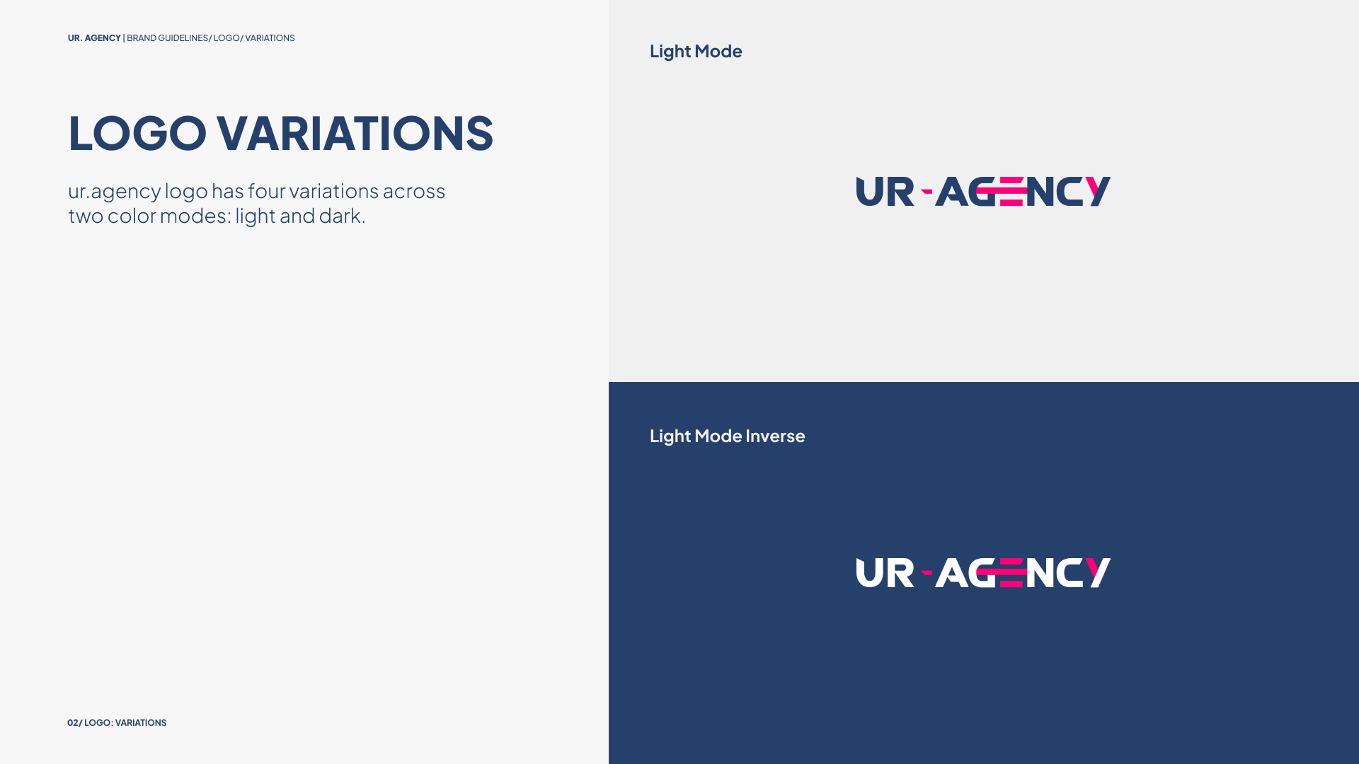
The dark mode pairs vibrant orange with deeper blue tones to create a bold, high-contrast aesthetic. In contrast, the light mode combines pink with muted blues for a softer, more understated expression. These palettes established distinct visual moods while allowing the brand to adapt to different interface environments.
Beyond color, I worked on typography and iconography to build a cohesive visual language across both modes. The comprehensive brand guidelines brought these elements together, defining how the visual system could be applied consistently while preserving the character of each version. The result was a flexible identity system that balanced visual distinction with brand recognition, extending beyond a logo to establish a more complete and adaptable brand experience.