
The Choose You Club - Branding
About the project
Date:
Client:
The Choose You Club
Services:
Branding

Project Details
The Choose You Club project involved developing a cohesive visual identity and brand system for a new membership community. The work included creating the logo system, color palette, typography, brand guidelines, and supporting design elements, alongside a flexible suite of social media, marketing, campaign, and member-experience assets. Deliverables included social media templates, launch graphics, landing-page visuals, email and promotional assets, welcome materials, and a digital member welcome kit, creating a consistent visual language.
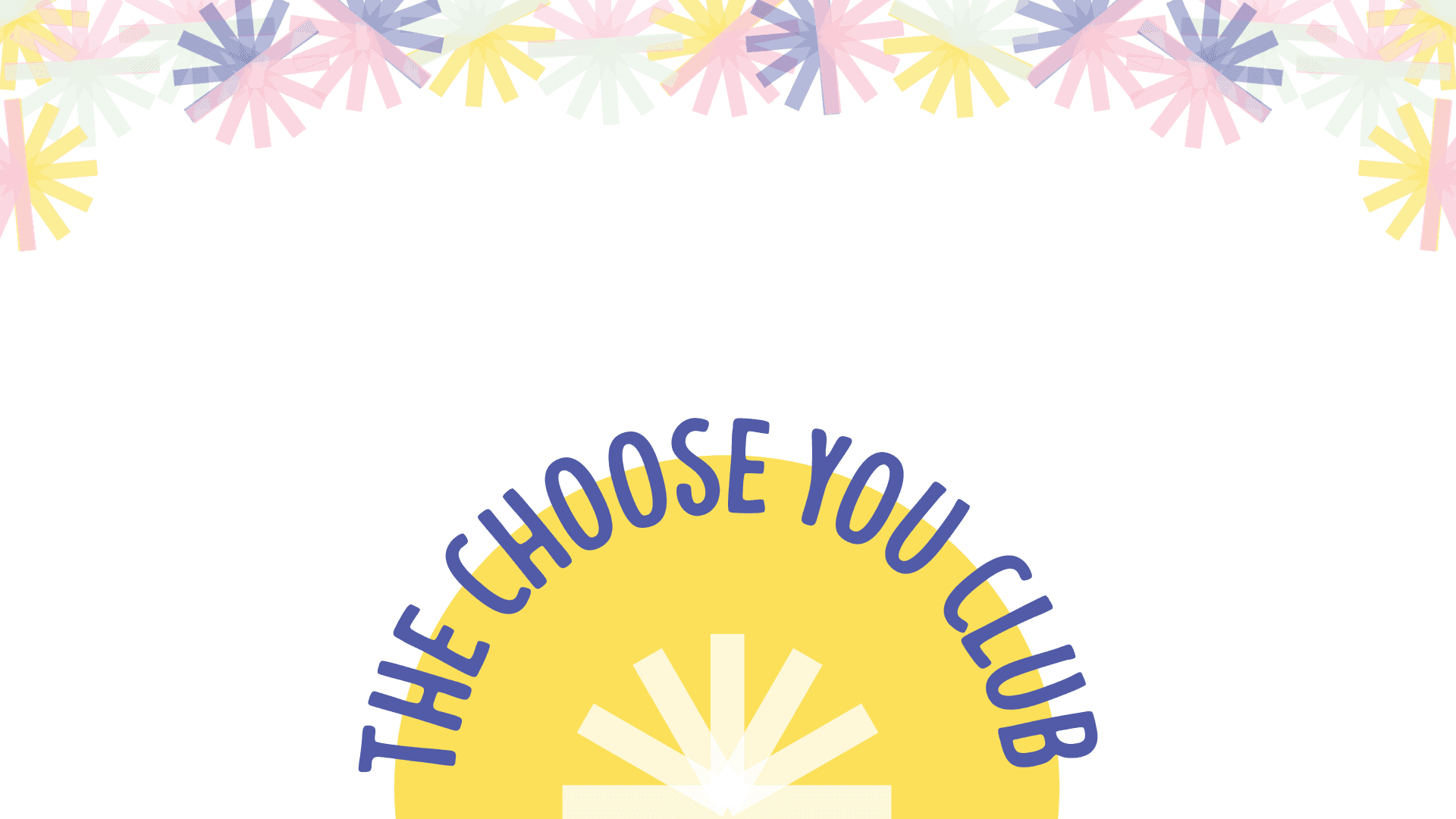
The process began with an exploration of the existing Anna Jinja Show brand, competitor research, visual audits, and mood boards to establish a distinct visual direction for The Choose You Club. Building on the brand’s themes of hope, belonging, and transformation, the identity evolved around a rising sun symbolizing new beginnings, a radiating centre representing the many paths of self-discovery, and a welcoming curved wordmark that communicates warmth and openness. Multiple visual concepts were developed and presented before refining the selected direction into a cohesive brand system.
From there, the identity was applied across marketing, social media, launch campaigns, print materials, and member communications, with feedback and iteration incorporated throughout the process. The project concluded with comprehensive brand guidelines, an organized asset library, production-ready files, and a range of applications demonstrating how the identity could work consistently across different brand touchpoints.


