Tally - Branding and UI Design
About the project
Date:
Client:
Tally
Services:
UI/UX

Project Brief
For this project I developed a cohesive brand identity, including a custom logo and visual system, to establish a strong market presence. Building on this foundation, Tally required a strong first point of contact to convert visitors into users. The objective was to design a visually appealing, user-friendly, and informative landing page aligned with this newly established brand identity that effectively engages visitors and drives action.
Goals
Brand Identity
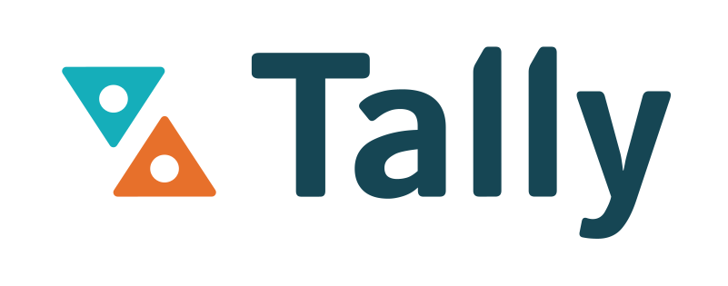
The logo was designed using simplified elements of an hourglass and the dots are taken from the colon of a timestamp. The edges of the triangles are slightly rounded to maintain visual consistency between the logo mark and the font used for the word mark. The colours are congruent with the brand’s personality, which wants to evoke clarity and creativity. The orange with the teal creates a stark contrast and represents energy and action.
Landing Page
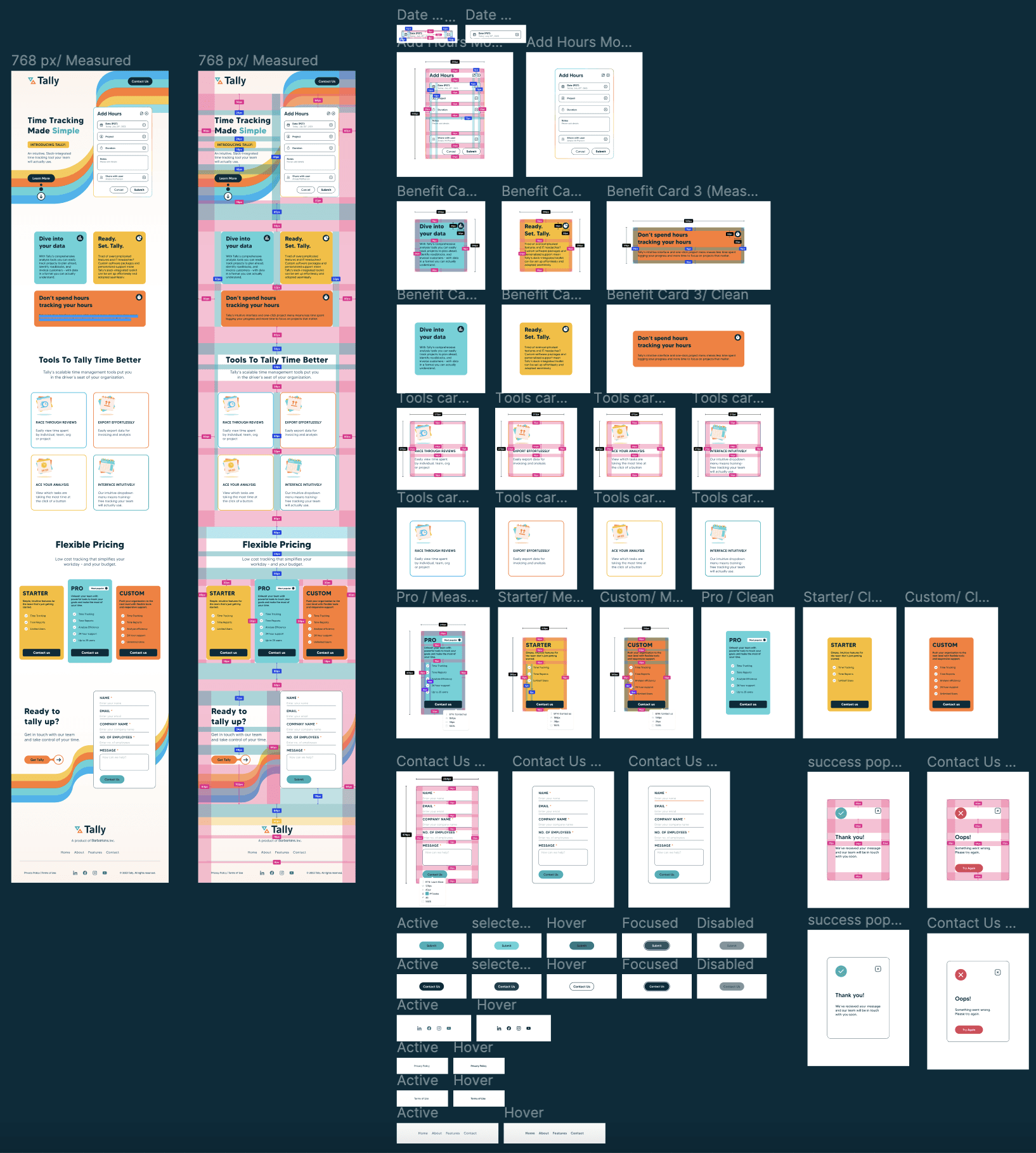
The Tally landing page design was created after multiple brainstorming sessions with the project manager and copywriter. These sessions allowed us to create a user flow which effectively communicates the apps features/ benefits and encourages the user to sign up or ask for more information.
Minimalistic design and layout ensures that the colours don’t become overwhelming.
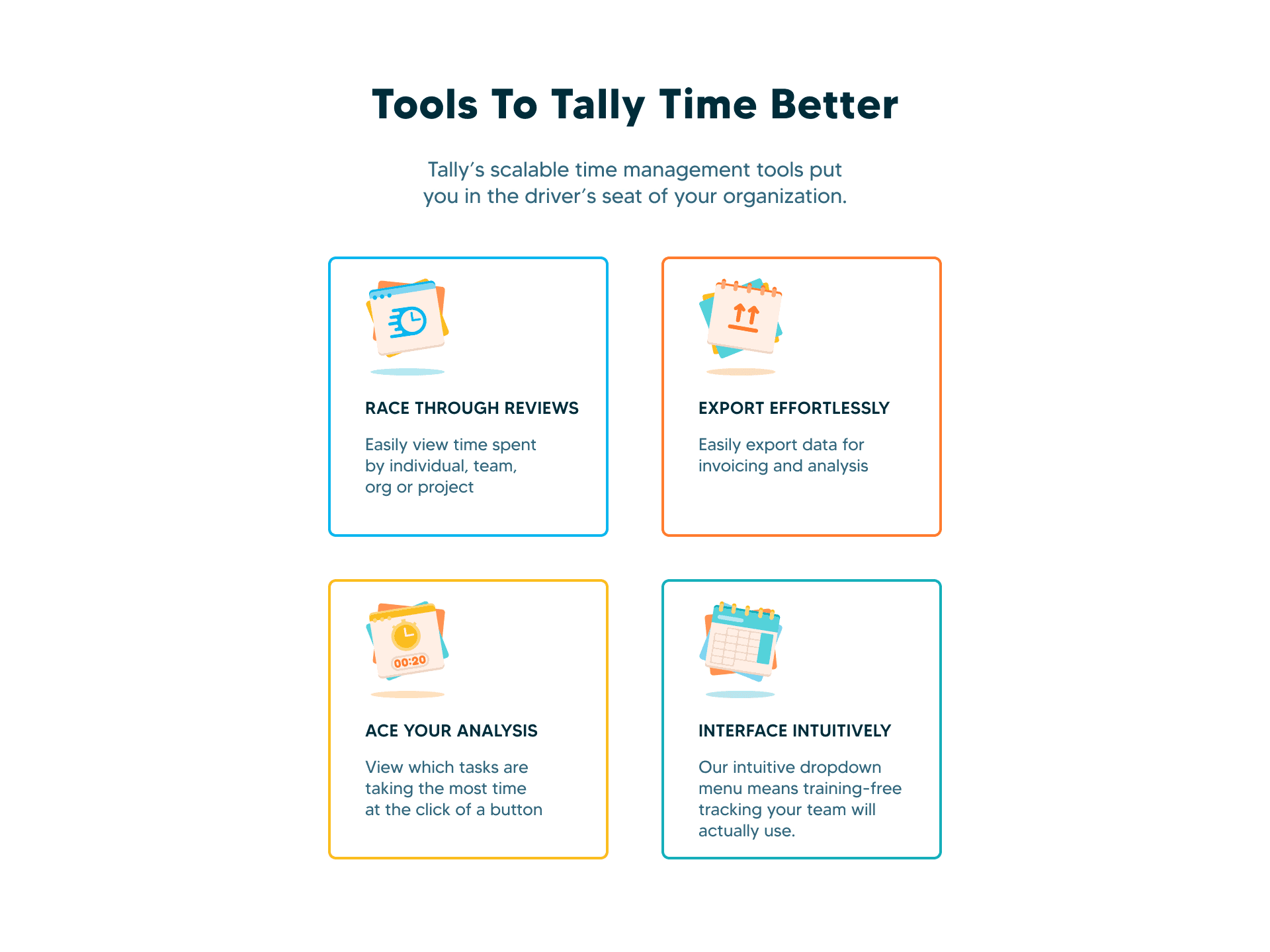
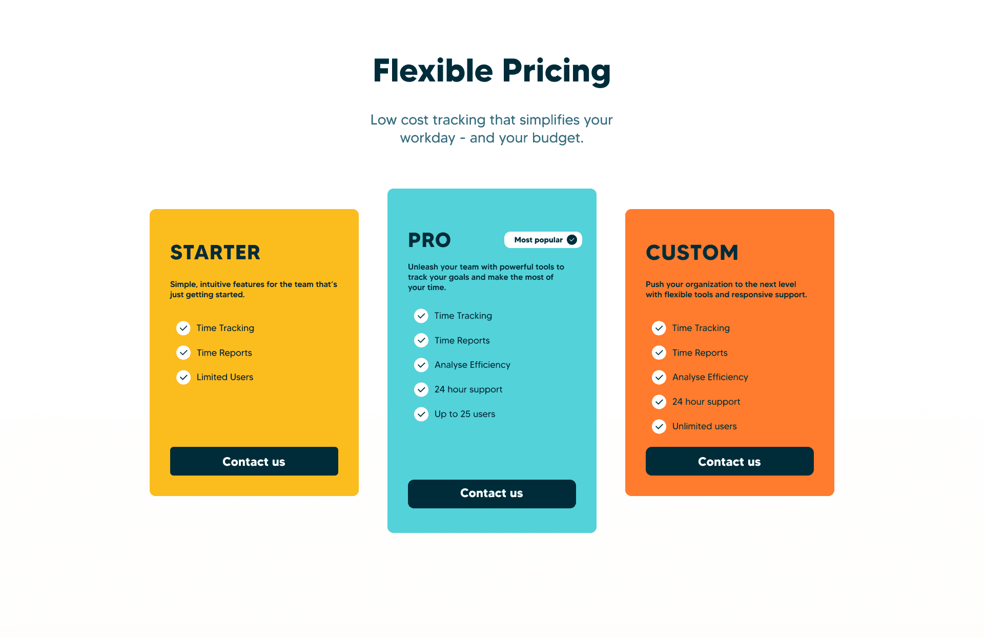
Each feature is visualised on a different colour block to create emphasis.
Placement of the background elements allow the users eye to travel down the page.